Eye Filmmuseum
From 2020 to 2022 I led the rebuild of eyefilm.nl for Eye, the Dutch national film museum. The trigger was a CMS reaching end-of-life; the work became a rethink of how the museum presents itself online: one platform for exhibitions, films, and tickets, one agenda feeding the website, the ticket desk, and the screens in the building. I started as lead developer and ended as product manager.
The client: an iconic Amsterdam museum
Amsterdam has about 50 museums, but Eye is one of the most instantly recognizable. Its striking white building, perched on the IJ across from Central Station, is a landmark in its own right. As I write this, they’re preparing to host Queen Máxima for their 75th anniversary.
But Eye is more than a museum. It’s a cultural center, cinema, restaurant, research institute, and exhibition space. Every day, digital and analog films are screened. Behind the scenes, their collection center holds over 50,000 titles, along with posters, equipment, and ephemera. Eye plays a vital role in preserving Dutch film heritage and promoting cinema at home and abroad.
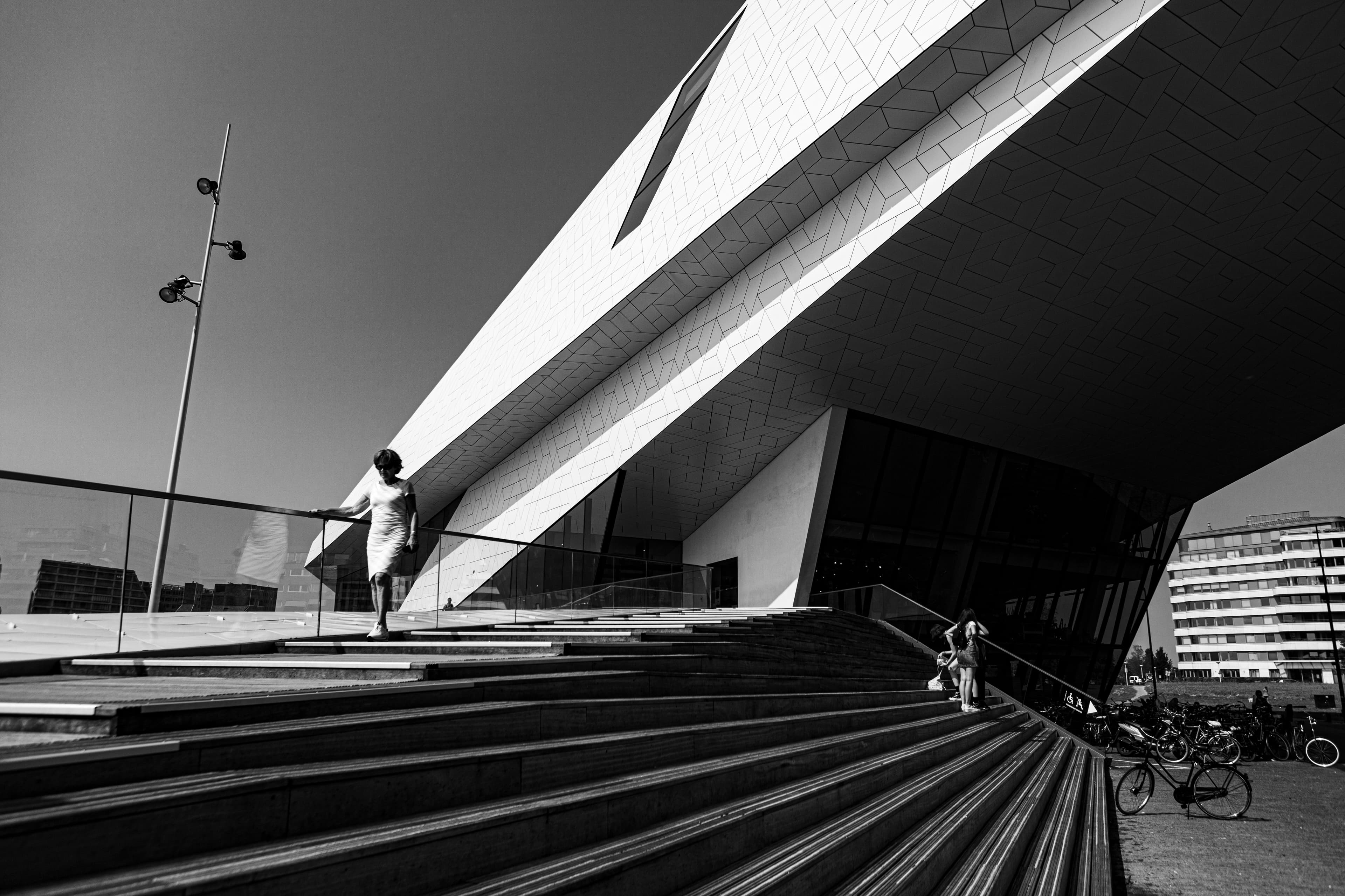
Entrance to Eye. Photo by Huub Zeeman.
The project: a new website
The initial trigger was technical: Drupal 7 was reaching end-of-life. But the real opportunity was strategic. A site rebuild invites the kind of institutional introspection normally reserved for 5-year plans or change-of-leadership cycles.
Eye could have simply ported the existing site to a modern framework. They used the moment to rethink workflows, team structures, and how the institution presented itself to the world. The heart of the museum is the building itself. Digital infrastructure, unlike the building, can be restructured, and in this case it needed to be.
The real challenge was shifting from a broad digital transformation trajectory into something more focused: delivering a coherent product.
The architecture: one agenda, three systems
Eye's programming information lived in three systems with three different owners:
- Ticketing, used by the website, the ticket desk (balie), and the narrowcasting screens in the building
- Programming databases, with structured metadata: directors, cast, stills, trailers, format, subtitles
- The CMS, where editors enrich pages with text, images, and related content
Eye's programming is rich and idiosyncratic. Each film listing carries its metadata and also hand-written editorial notes contextualizing that showing within a specific program. If the same film appears in two different series, it gets two different write-ups. The archive is a treasure trove.
The architectural principle we settled on was to compose these systems rather than merge them. Each system stayed the source of truth for what it owns, and every film page pulls from all three on the fly. We did not try to jam everything into the CMS: automated data stays in its own systems, editors write only what only they can write, and pipelines layer the two together at the page. This kept editorial freedom and structural clarity from working against each other.
The same separation produced the omnichannel agenda: one schedule powering the website, the balie, and the narrowcasting displays, all pulling from a shared system. I led that effort across the teams that owned each channel.
The challenge: multiple audiences, one homepage
The old homepage tried to be everything to everyone. It was structured around departments rather than audiences. Content was hard to find, and even basic tasks like checking what was playing that day were buried. Internally, teams felt their work was invisible. Marketing flagged a lack of urgency and differentiation: why should someone go to Eye today? And why Eye, rather than a regular cinema?
Satisfying every stakeholder would have produced a consensus-driven patchwork. We worked with the design team on a radical shift instead. The new homepage prioritized exhibitions first, then film programming via a tightly designed agenda. Navigation was reimagined from the ground up to reflect actual user journeys. We emphasized landing pages, anticipating that most visitors arrive via search rather than the front door.
The homepage became a clean, two-paneled design:
- The first panel showcased curated highlights: exhibitions, special film programs, conferences.
- The second showed a structured daily agenda: scan-friendly, detailed, and one click away.
Typography was restrained, content anchored to a left-aligned reading line. This made dense information easier to scan without flattening it.
- Screenings with Q&As or interviews were highlighted.
- Flexible landing pages gave space to departments like education, collections, research, and the restaurant.
- SEO strategy shifted away from assuming the homepage as the sole point of entry.
My role: from developer to product lead
I started as lead developer, joining early workshops to map the goals, constraints, and internal systems. My initial responsibility was to define a technical strategy that could accommodate Eye’s sprawling organizational structure: collections, programming, education, research, exhibitions, and more.
As the project evolved, I stepped into the role of product manager. That meant coordinating the content, tech, design, and programming teams, each with its own logic and priorities. I briefed external agencies, ran selection rounds, wrote documentation, and gave regular presentations to staff across the entire organization to maintain alignment and momentum. Much of the job was translation: turning what one team knew into terms another team could build on.
My job was to keep the product vision clear, communicable, and deliverable, from first sketch to final launch.