Bloum
Bloum est une fleur en papier : pliée à la main, sans moule ni machine, dans du papier qui a déjà été autre chose. Une fleur coupée est fanée en une semaine et celle-ci tient. Le site le dit en une seule page, dans la voix même de la créatrice. La commande vient de OK Creative Agency, l'agence de Haarlem à l'origine du projet.
Une liste de raisons
Celui qui achète des fleurs les achète parce qu'il y a quelque chose à dire. Bloum part de ce bout-là. Chaque fleur quitte l'atelier dans une carte portant les mots du donneur, et pour ceux qui ne les trouvent pas la page tient une longue liste de raisons d'offrir une fleur à quelqu'un. Omdat je altijd eerlijk tegen me bent, parce que tu es toujours honnête avec moi. Omdat je leuk kijkt als je kauwt, pour la tête que tu fais en mâchant. Omdat je kat nu echt niet meer terugkomt, parce que le chat ne reviendra vraiment plus.
Les raisons sont disposées comme les cartes elles-mêmes, chacune sur sa propre couleur avec une petite fleur imprimée dans le coin, des photographies des vraies fleurs posées parmi elles. L'humour de la liste fait davantage pour la marque que n'importe quelle description du papier.
Une fleur pousse à mesure que l'on défile
Passé les photographies, la page devient verte. Deux grands vases se dressent contre le champ, dessinés dans le même langage plat de papier découpé que les cartes imprimées, et le défilement fait grimper une tige hors de chacun, sortir des feuilles et s'ouvrir en une fleur. Pendant qu'elle pousse, les raisons passent une à une par le ventre des vases.
L'essentiel du travail est passé dans la manière dont la page bouge. Le défilement est adouci, de sorte que la scène glisse au lieu de sauter. Les grandes fleurs se penchent vers la souris et reviennent quand elle s'éloigne. Une abeille et un papillon traversent le champ selon leurs propres trajets, indifférents au lecteur. Rien sur la page ne reste tout à fait immobile, et rien ne bouge assez vite pour réclamer l'attention.
Travailler à partir d'un cahier de style
OK Creative m'a remis un cahier de style : les illustrations de fleurs, une gamme de couleurs, la typographie, une voix. La page elle-même restait à concevoir. La mise en page, le mouvement et l'animation sont de moi, et j'ai appliqué les couleurs et les caractères pour que les sections de ce long format se distinguent d'un coup d'œil. Les détails ont été réglés avec le directeur artistique au fil de plusieurs séries d'échanges.
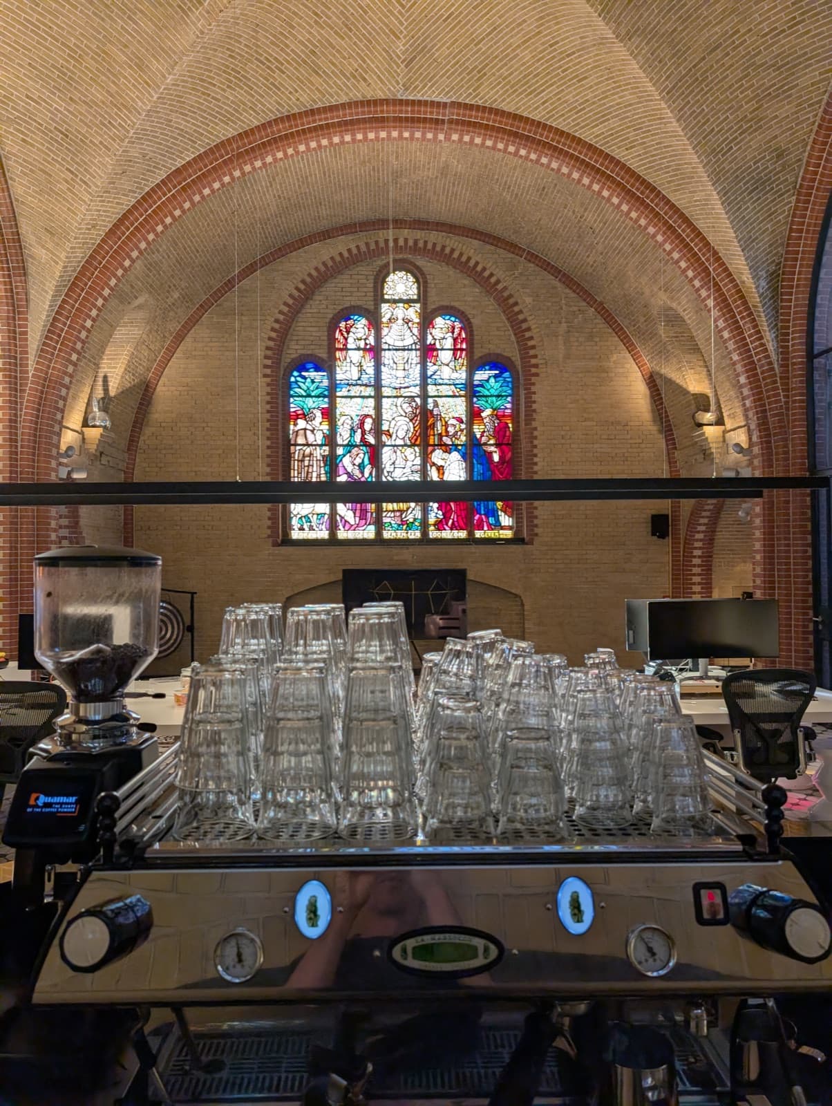
J'ai fait le travail au bureau de l'agence à Haarlem, une ancienne chapelle d'hôpital. Les retours venaient par demi-phrases, « Je ne sais pas trop ce qu'est le produit », ou « les couleurs sont juste un peu à côté », et comme nous étions dans la même pièce je pouvais d'ordinaire voir ce qui était visé avant que les mots aient été trouvés.
Une page, entretenue par sa créatrice
Le site tourne sous Craft CMS. Les raisons, les points de vente, les photographies et chaque ligne de texte sont des champs, si bien que la liste peut s'allonger dès qu'une nouvelle raison se présente et qu'une nouvelle boutique peut être ajoutée le jour où elle commence à vendre les fleurs. Une marque aussi petite ne devrait jamais avoir à demander à un développeur avant de pouvoir changer d'avis.